


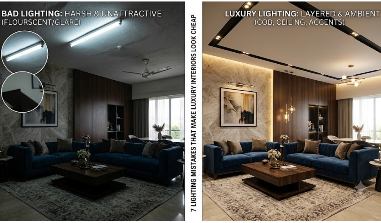
7 Lighting Mistakes That Make Luxury Interiors Look Cheap
Good lighting can make a small room feel grand. Bad lighting can make a grand room feel small and cheap. Many architects and builders spend huge budgets on marble, wood, and custom furniture, but forget one simple truth: lighting decides how all that expensive work is finally seen.
This blog is for architects, builders, contractors, and homeowners who want their interiors to look truly premium. Below are 7 common lighting mistakes, why they hurt the design, and how to fix them.
1. Using Only One Light Source in a Room
A single ceiling light in the center of a room creates flat, harsh shadows. It lights the floor but leaves walls, corners, and furniture in the dark. This is one of the biggest reasons expensive interiors still feel like a budget hotel room.
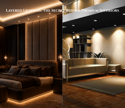
Fix: Plan lighting in layers. Combine ceiling lights, wall lights, floor lamps, and accent lights. At least three light sources per room is a good starting rule for living spaces.
2. Choosing the Wrong Color Temperature
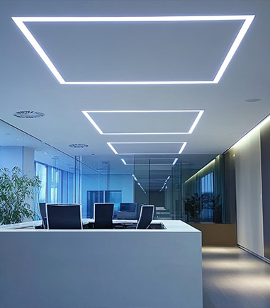
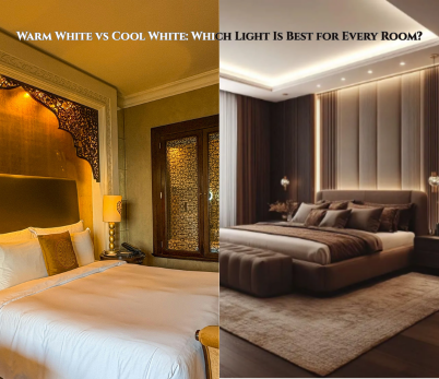
Cool white light (above 4000K) makes warm materials like wood, brass, and stone look dull and clinical. It works in hospitals and offices, not in homes meant to feel warm and rich.
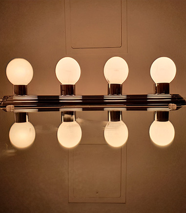
Fix: Use warm white light between 2700K and 3000K for living rooms, bedrooms, and dining areas. Save cooler tones only for kitchens or workspaces where task focus matters more than mood.
3. Ignoring Layered Lighting Design
Many projects only plan for general lighting and skip task lighting and accent lighting completely. Without these layers, a room has no depth, and expensive decor pieces get lost in shadow.
Fix: Design three layers for every space:
- Ambient lighting – overall room brightness
- Task lighting – focused light for reading, cooking, or working
- Accent lighting – highlights art, textures, or architectural features
4. Exposed or Poorly Placed Fixtures
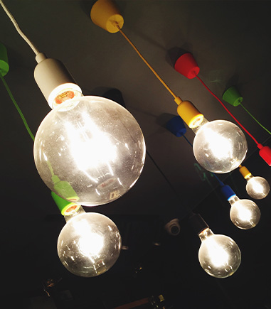
Visible bulbs, harsh downlights, or fixtures placed without thought can ruin an otherwise beautiful ceiling design. Guests notice glare before they notice good architecture.
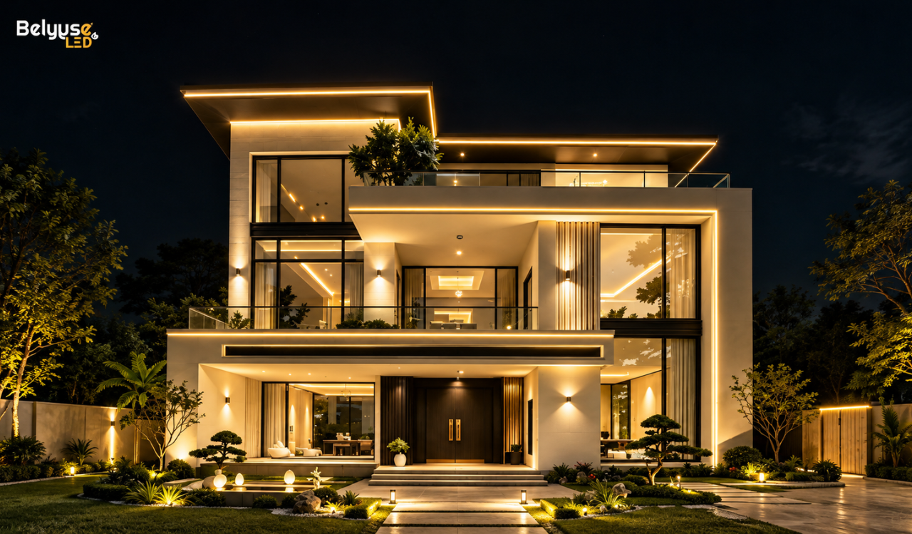
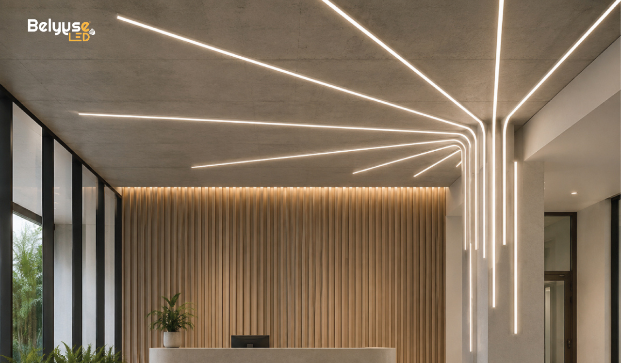
Fix: Recess fixtures wherever possible. Use trim-less downlights or cove lighting so the light is visible, but the source is hidden. This keeps ceilings clean and adds a hotel-like finish.
5. Skipping Dimmers and Lighting Controls
Fixed brightness lighting forces every room into one mood, all day and night. A bright, uniform glow at 9 PM does not feel luxurious; it feels like a showroom.
Fix: Install dimmers on every major circuit. Let homeowners shift from bright daytime light to soft evening ambience with one switch or a smart control panel.
6. Wrong Fixture Scale and Placement
An oversized chandelier in a small foyer or a tiny pendant over a large dining table breaks the visual balance of a room. Wrong scale is easy to spot, even by people with no design training.
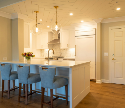
Fix: Match fixture size to room size and ceiling height. As a general guide, a pendant over a dining table should be about one-third the width of the table, and hung 30 to 36 inches above the surface.
7. Forgetting to Light Vertical Surfaces
Most lighting plans point straight down, lighting only the floor. Vertical surfaces get ignored, so walls, art pieces, and design details disappear into shadow, and the whole room reads smaller than it actually is.
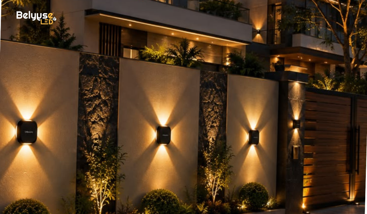
Fix: Add wall washers, picture lights, or wall sconces to bring light onto vertical surfaces. This technique is used heavily in five-star hotels and high-end retail stores to make spaces feel larger and richer.
Final Thoughts
Luxury is not only about expensive materials. It is about how those materials are shown to the eye. A well-lit budget-friendly room can look more premium than a poorly-lit expensive one.
For architects, builders, and contractors, lighting should be part of the design conversation from day one, not an afterthought added after construction. Getting these 7 points right is often the difference between a space that looks costly and one that simply looks correct.